The development history of the MukerBude logo
From 2005 to 2008 the MukerBude was only a tiny offshoot of the then
first development of a free of charge from the provider provided
Subdomain - PetersWelt - created with its WebPage construction kit. A
LinkCollection - for me a replacement of the favorites known under Windows,
accessible everywhere - in a so-called "one-site" that is becoming longer and longer
page". From today's point of view horrible to look at, but very practical.
2008 then the first development of an own domain on the basis of a
free templates from SIS-Papenburg[which I still use to this day to create large
Thanks to] - PetersKosmos - an advisor for many situations of life of the
has endured until today. The category MukerBude created in it became
due to my increasing musical ambitions are still growing
in the same year independently and also soon its own domain the today's
"old" Muker place.
In 2010, the first timid design of a logo for the
MukerBude.
The original guitar pictogram depicts a Gibson ES 335 - the I
I have appreciated playing for many years like no other electric guitar!
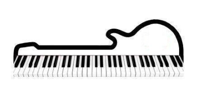
Here is another variation of the first logo, doubled in size.
If you have been following the MukerBude for a long time, you know that this graphic is 90
Urzeiger-Sinn rotated with white on dark red represents the original logo of 2010.
Due to a storage crash, there are no more images.
Like the following picture, only it was in the colors white on dark red.
If you still have an original - maybe in the undeleted browser buffer -
I'd be very grateful if you could send it to me.
Over the years I have passed on all my electric guitars and have exclusively
to acoustic guitars. First a fantastic sounding Western jumbo,
that is still in my possession today.
So I also needed a new logo adapted to my ambitions.
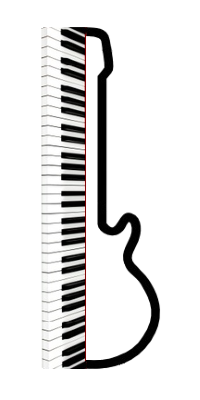
Guitar with keyboard white on dark red. Why I did this back then in a completely
unsuitable GIF image format remains closed to me until today.
Look at the grissel in the body of the guitar.
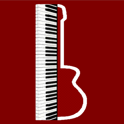
In 2017, the strong increase in the activities of the MukerBude to a new abstract logo.
The gold of the bass is wanted, the lilac of the treble strings is not
by using two different DTP programs.
The MukerBude has become my favorite object on the Internet, so I also want to
the logo express my musical preferences. "Guitar Abstract"
Years ago when I rediscovered making music for myself, I went to my
ConcertGuitar quickly a KeyBoard and in the course of time also a clarinet
as well as various electric guitars.
Today I can use the clarinet on children's birthday parties to make their eyes shine
and then mine.
KeyBoard with corresponding SoundModulation programs is limited for me
on rhythm, accompaniment and extravagant sounds. KeyBoard is for me
always write a little like computer keyboard.
Dedicated keyboarders I ask to forgive me this statement ;-)
My instrumental preference is and remains the CONCERT GUITAR !
Admittedly, it doesn't have the polyphony of a piano, nor the sustain
of a cello (quote John Williams).
But it has an almost infinite variety of possibilities of tone formation.
In 2017 I fundamentally reworked the design of the old MukerBude and presented it under
another, a dropping out menu. That should be my new variant of the old
WebPage, which it was only for a few months. Of course, a new
logo to express the new.
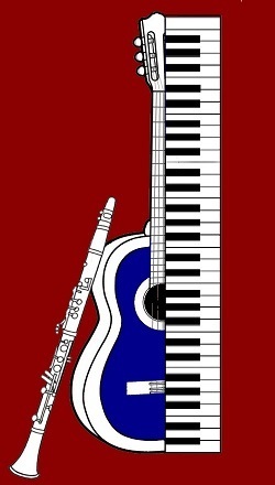
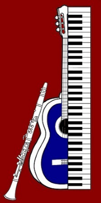
Following the original logo - keyboard with guitar - I have created a
clarinet and make it look a little less schematic, with
a light touch of photorealism.
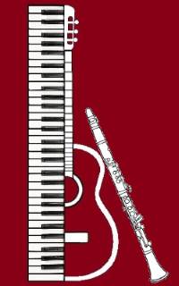
Pretty as I think, but nothing half and nothing whole, just like the
"Old MukerBude", good for big viewports, no use on small ones.
The decision for a real renewal had been consolidated, that's the only way it was possible.
possible to create a cross-platform "Responsive Web Design".
and enable this to be viewed on all devices.
During the conversion and further development of another template from SIS Papenburg
- which suit my taste in design best - I have worked parallel on a new
logo.
After a not inconsiderable number of useless ideas - whereby a friend of mine
with his designs. "Thanks to Jürgen K."
Here the new logo as a recognition sign in e-mails...
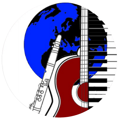
Under the motto of the website "flat design" which in my opinion also refers to the
the design of the website, I have come to this quasi photo realistic picture with
tribute to René Magritte.
1. May 2018 the complete new development of the basic framework of the MukerBude is
and stands in the net, it carries this logo as a recognition image.
LOGO the new MUKERBUDE in the Year 2018
Now I will concentrate again on the editorial work in the MukerBude.
I hope that the somewhat daring color scheme
just as much as I like and you guys keep having fun!
